
The Power of Slow Reveal Graphs
Teachers can leverage students’ curiosity to explore visual representations of data in an engaging way.
Your content has been saved!
Go to My Saved Content.Graphs and data visualizations are all around us—charting our steps, our election results, our favorite sports teams’ stats, and trends across our world. But too often, people glance at a graph without really engaging. They skim past important details or feel overwhelmed by the complexity. If we want students to thrive in a data-rich world, they need opportunities to develop strong data habits: slowing down, thinking deeply, and constructing meaning.
One powerful way to do this is through a routine called slow reveal graphs.
What is a slow reveal graph?
A slow reveal graph is an instructional routine that uncovers parts of a graph, step-by-step, culminating in a final reveal that brings together students’ evolving ideas. Using a slide deck, teachers begin by displaying a stripped-down version of a graph—labels and numbers hidden, leaving only the shape of the data—and then gradually add elements, such as the categories of the bars, the scale along the x- or y-axis, and the title.
At each stage, students pause to notice patterns, ask questions, and revise their thinking. By the time the full graph is revealed, students have constructed meaning collaboratively, engaging in deep mathematical thinking and cross-disciplinary sensemaking.
The easiest way to understand this routine is to experience it, so let’s dig into a vignette from a fourth-grade classroom.
In the Classroom: A Fourth-Grade Example
My fourth-grade students were working on a unit about multiplication, so I chose a pictograph in which each icon represented 20 people to spark thinking about multiples. However, the students wouldn’t learn that until much later in the slow reveal. First, I showed them this image:
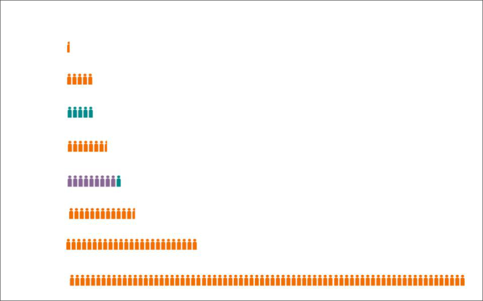
I asked students, “What do you notice? What do you wonder?” I gave them an opportunity to turn-and-talk before sharing with the whole class.
Students were fascinated by the colors. “There’s lots of orange, some teal, and some purple.”
“The teal and purple are always whole,” another student pointed out, drawing us in deeper. I asked her to clarify. “Sometimes, the orange people are cut in half.”
Students speculated that maybe those half-figures represented someone sick or dead. Other students shared ideas about how the rows increased in size, steadily increasing like steps before a giant increase for the last row.
We annotated all of these ideas on the interactive whiteboard.
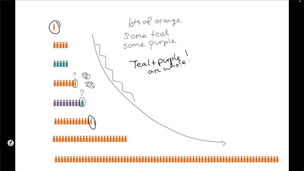
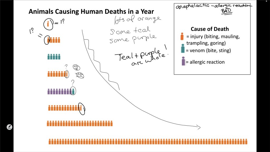
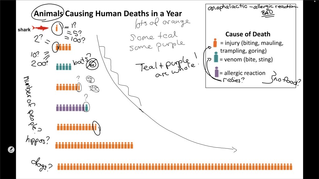
The First Reveal: The Title and Key
Then, it was time for our first reveal. When I advanced to the next slide, the title and incomplete key popped up.
I asked students, “What new information did we just learn?” This question helped ensure that all of the students focused on the same details. “How does it change your thinking about this graph?” Each reveal adds another piece to the puzzle, slowly telling the story of how to read and interpret the graph.
Students quickly started revising their thinking about the half-icons. “Since it’s about deaths, maybe the half means one person,” one student suggested. “Or maybe 10.” Students reasoned about the scale. If the half-icon represented one person, then a whole icon represented two people. If the half-icon represented five people, then the whole icon represented 10. But did those numbers make sense? And what did each row represent?
The Second Reveal: A Category
I advanced another slide to show that the first row was labeled shark.
Students wanted to discuss the scale again. Would it make sense that one person each year dies of sharks? Or would it make sense for it to be something else, maybe 100?
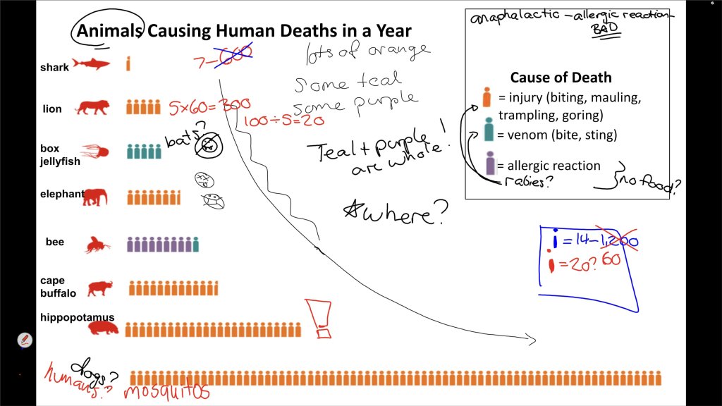
Subsequent slides revealed more and more animals. Students accurately predicted the bee, which was the only animal that caused death in two differently colored categories: venom and allergic reaction. With each reveal, students revised their thinking about the scale, and quickly they developed a reasonable range: 600 shark deaths would mean 6,000 lion deaths, and that was too much. Maybe each icon represented 14 or 20.
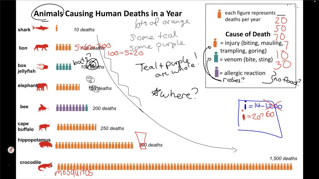
The Final Reveals: One Last Mathematical Clue
Students were eagerly anticipating the reveal of the last part of the key: Each figure represented ___ deaths per year. Instead of revealing the number, I revealed the total numbers for each row: 10 deaths from sharks, 100 from lions. Students were then able to correctly determine that each figure did, in fact, represent 20 deaths, each one a person with a full life. That’s a lot.
This basic, predictable structure works in classrooms of all ages, including in primary grades. The storytelling element sparks curiosity, builds suspense, and gives students a clear structure for sensemaking, allowing them to layer new insights to reach a more nuanced and sophisticated interpretation.
Enacting Slow Reveal Graphs
There are several websites that offer free slide decks of slow reveal graphs for K–12 and beyond, including SlowRevealGraphs.com. The topics vary widely, from comparing the number of teeth that different baby animals have to data about natural disasters. This routine works across content areas, as well, to help students build lasting habits of data sensemaking across the disciplines.
Students need deliberate work with graphs and other visualizations to develop strong data literacy. The slow reveal graphs routine both honors the complexity of data visualizations and creates accessible entry points for every learner. Because revision is expected and careful observation is valued, students focus less on being “right” or “wrong” and more on making sense of the data together. Regularly engaging with slow reveal graphs helps students develop the data literacy they need to participate in and shape our data-rich world.