Do Dyslexia Fonts Actually Work?
Specialized fonts for students with dyslexia are gaining in popularity. But they’re based on a key misconception, experts warn.
Your content has been saved!
Go to My Saved Content.In 1927, Samuel Orton, a neuropsychiatrist, observed that many of his young patients with reading difficulties reversed similar letters, confusing d for b, for example. Concluding that the condition was caused by “directional confusion,” he coined the term strephosymbolia, meaning “twisted symbol.” The characterization, but not the coinage, stuck—and fueled early speculation that what came to be known as dyslexia was a visual disorder that caused printed letters to appear as a confusing, jumbled mess.
Since then, a cottage industry of dyslexia-focused products has emerged, hawking everything from prisms to tinted glasses and transparent color overlays. One website catering to dyslexic readers—whose tagline promises to solve “complicated problems with a simple solution”—sells prism glasses, offering up a slew of testimonials touting the product’s benefits. “My reading has improved from 4th grade to college level,” exclaims one satisfied wearer.
In the last decade, another contender—typographic fonts designed to alleviate the reading difficulties associated with dyslexia—has entered the popular discourse. The simple, classroom-friendly intervention claims to improve the speed and accuracy of dyslexic readers by adjusting the size and shape of fonts, adding thicker lines to help students distinguish between similar letters. The designers of the fonts claim that the “heaviness” of the letters, for example, prevents them from flipping upside-down or left-to-right, while the arms—the top of a b or d, for example—have varying thicknesses to reduce possible confusion.
According to the Yale Center for Dyslexia and Creativity, dyslexia is the most common learning disability, affecting one in five children. Students with dyslexia often struggle to read, prompting teachers to search far and wide for helpful remedies. The market for solutions is large and alluring.
But the new fonts—and the odd assortment of paraphernalia that came before them—assume that dyslexia is a visual problem rooted in imprecise letter recognition. That’s a myth, explains Joanne Pierson, a speech-language pathologist at the University of Michigan. “Contrary to popular belief, the core problem in dyslexia is not reversing letters (although it can be an indicator),” she writes. The difficulty lies in identifying the discrete units of sound that make up words and “matching those individual sounds to the letters and combinations of letters in order to read and spell.”
In other words, dyslexia is a language-based processing difference, not a vision problem, despite the popular and enduring misconceptions. “Even when carefully explained, soundly discredited, or decisively dispatched, these and similar dyslexia myths and their vision-based suppositions seem to rise from the dead—like the villain-who-just-won’t-die trope in a B movie,” the International Dyslexia Association forcefully asserts.
Dyslexia Fonts, Under the Microscope
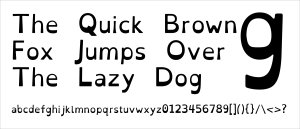
Under close scrutiny, the evidence for dyslexia-friendly fonts falls apart. In a 2017 study, for example, researchers tested whether OpenDyslexic, a popular font with thicker lines near the bottom of the letters, could improve the reading rate and accuracy for young children with dyslexia. According to the developers of the font, which is open-source and free of charge, the “heaviness” of the letters prevented them from turning upside down for readers with dyslexia, which they claimed would improve reading accuracy and speed.
Researchers put the font to the test, comparing it with two other popular fonts designed for legibility—Arial and Times New Roman—and discovered that the purportedly dyslexia-friendly font actually reduced reading speed and accuracy. In addition, none of the students preferred to read material in OpenDyslexic, a surprising rebuke for a font specifically designed for the task.
In a separate 2018 study, researchers compared another popular dyslexia font—Dyslexie, which charges a fee for usage—with Arial and Times New Roman and found no benefit to reading accuracy and speed. As with the previous dyslexia font, children expressed a preference for the mainstream fonts. “All in all, the font Dyslexie, developed to facilitate the reading of dyslexic people, does not have the desired effect,” the researchers concluded. “Children with dyslexia do not read better when text is printed in the font Dyslexie than when text is printed in Arial or Times New Roman.”
“I don’t necessarily think teachers need to go and get a special font,” says Julie Rawe, a member of W3C’s Cognitive and Learning Disabilities Task Force and a reading and disability expert at Understood. “So far, the research doesn’t really have a lot of evidence showing that these special fonts help kids or adults with dyslexia to read faster or make fewer mistakes.”
Giving False Hope
Dyslexia fonts may also give students false hope—and result in disappointment, the researchers of the 2017 study warn. “The most harm may come when students who have already experienced significant struggle and academic failures related to learning to read have yet another experience with failure when they are not able to read significantly better in a font designed to do so,” they caution.
That’s because children with dyslexia often have to deal with the stigma of being behind their peers, and they may conclude that they’re not smart enough to master the materials, according to a 2010 study. If a child is told that a dyslexia font can help them read, but it doesn’t actually improve their grades or their reading experience, they may assume that the problem lies with their own inability—not with the font.
Legible Fonts and Evidence-Based Instruction
Fonts do matter, experts at the British Dyslexia Association explain, but only because they matter for all readers: “Adopting best practice for dyslexic readers has the advantage of making all written communication easier on the eye for everyone.” They recommend fonts designed for general legibility, like Arial, Verdana, and Tahoma. For better reading outcomes, font size should be between 12 and 14 points, and section headings should be used to create a consistent structure within your documents, easing navigation and supporting better sense-making.
Of course, typography is just one small part of the puzzle. Most children with dyslexia can learn to read—but it takes considerably more time and effort than for their peers, according to the Yale Center for Dyslexia and Creativity. Reading instruction should be “evidence-based, systematic, and delivered in a small group setting,” they say, and should include explicit instruction in phonemic awareness and phonics, with many opportunities to practice reading skills in a supportive environment. The International Dyslexia Association recommends a “multisensory, structured language approach” that systematically integrates several senses (hearing, seeing, touching) while the child is learning to read.
Classroom accommodations such as audiobooks, note-taking apps, video recordings of assignment instructions, and text-to-speech software can help students with dyslexia feel supported and accepted, explains former literacy teacher Jessica Hamman. Tasks that appear simple to most students may take extra time for those with dyslexia, so it’s important to provide tools “that take into account their unique processing challenges and allow them to demonstrate their content understanding and access the curriculum with more ease,” she says.
The Takeaway
On scores of reading speed and accuracy, dyslexia fonts perform no better than common fonts like Arial and Times New Roman, and sometimes they perform worse, according to recent studies. Even using dyslexia fonts with neutral effects can raise false hopes in struggling young readers, contributing to feelings of helplessness and discouragement.