Easy Reading: A Breakthrough for the Reading Disabled
A new font for dyslexics makes sentences a snap.
Your content has been saved!
Go to My Saved Content.
Reading and writing may be cornerstones of an education, but to those afflicted with dyslexia, they're no simple matters.
About 15 to 20 percent of the world's population suffers from a reading disability. Of those, roughly 85 percent are dyslexic, according to the International Dyslexia Association. Dyslexia makes reading even the simplest sentence tricky, as the differentiation of letters and words becomes a confusing tangle.
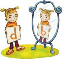
A new font could help change that: Read Regular treats individual letters as unique shapes so that the traditional uniformity of letters in many fonts doesn't so easily confound the struggling reader. The letter d, for instance, is not a mirror reflection of b, nor is the curve of e exactly like that of c. Ascending and descending letters such as h and p are longer, to ensure legibility, while the spaces in the letters e and o are kept wide open, and g and a don't have extraneous lines and loops. The result is clean, attractive, and decidedly readable.
Read Regular, developed by dyslexic Dutch graphic designer Natascha Frensch, who also compiled the reference book, Read Regular for More Effective Reading and Writing, doesn't stigmatize, as other disability accommodations might. It looks, well, regular, and just plain pretty. Its focus on the uniqueness of each letter, too, can help any youngster -- regardless of ability -- read more quickly and easily. No wonder London's Chrysalis Books has decided to dub the font the standard typeface for all its children's textbooks.