Using Infographics to Build Media Literacy and Higher-Order Thinking Skills
Teaching infographic literacy involves asking students to flex their critical thinking skills—and their creative muscles.
In a world where simply reading the news requires significant statistical and visual literacy, infographics have become prolific in magazines and news sites—where they’re used to explain everything from political projections to public health to Hawaiian volcanic eruptions.
By now, almost everyone has come across the infographic. In short, they’re visual representations of complex information and they typically meld some combination of charts, graphs, images, words and numbers—often in clever and striking ways that are capable of telling stories just as well as blocks of text, and often in less time.
Today’s kids are hardly strangers to the form. Sports publications, for example, often include statistical analyses comparing stars like LeBron James and Kevin Durant, or exploring the way that famous soccer players stack up against each other in terms of goals, conversion rates, and passes.
Meanwhile, research shows complex visuals and illustrations are becoming prevalent across children’s media, including textbooks, where graphics now convey information that, more often than not, isn’t found anywhere else in the text. And additional studies have found that about 13% of third-grade reading comprehension is strongly related to making sense of images that accompany text.
According to a new paper by researchers Jennifer M. Smith and Marla K. Robertson, teaching students how to interpret the modern infographic is an essential skill, and an important part of multimodal learning.
Making sense of numerical claims is especially important given that many infographics can be confusing or downright misleading when they use exaggerated scales, remove the zero point, or engage in other trickery to present information in inaccurate ways. (Older students may get a kick out of deconstructing the many egregious examples featured on the Twitter account ChartCrimes, which is devoted to calling these out).
How to Teach Infographic Literacy
There are plenty of ways to teach infographics in the classroom, but most experts and researchers believe in slowly scaffolding students’ understanding of them in thoughtful ways.
Start by introducing the concept and explaining their purpose, then conduct visual read-aloud or think-alouds of existing infographics. Next, help students decode the graphics themselves, asking them to jot down notes about what they do and don’t understand, before eventually asking students, even young ones, to start creating their own.
Beginning in middle school, students can even use them to present and share research findings that might otherwise take shape as writing assignments or slideshare presentations.
“Creating infographics involves higher level thinking skills as students must analyze their information, synthesize multiple pieces of information, and make evaluations to determine what to include in the limited space of an infographic,” say the authors.
To further guide teachers, Smith and Robertson suggest a new framework breaking down the concept into four steps: exploration, investigation, creation, and interrogation—useful for upper elementary classes and above.
Exploration
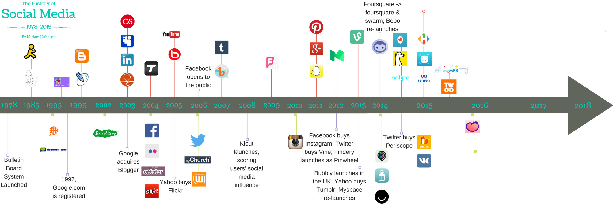
You can use infographics to contextualize maps and compare two or more things, such as in the World Cup example above. But they can also tell a story in chronological order (the long history of social media), bring otherwise drab statistics to life (the anatomy of a teacher), and break down big ideas into smaller, digestible pieces (how peat traps carbon from escaping into the atmosphere).
Having an infographic to illustrate each purpose is handy, so it’s important to introduce students to a wide array of them. These days, the highest quality infographics are typically found in dedicated books from major publishers, but plenty of quality ones are also floating around online, including those from:
The authors suggest modeling how to read an infographic by projecting it for the whole class, sharing observations and design choices, and asking students what they notice. In small groups, students can practice their close reading skills as they learn to read and interpret complex graphics.
Investigation
Think of this as the deconstruction phase. After students learn to read an infographic, they must further analyze how infographics layer elements, such as text, color, illustrations, and numbers to convey meaning. As the authors note, “Separating these modes is an important step in students understanding the significance of attending to both the printed word and the visual elements.”
Smith and Robertson suggest spending some class time modeling how a media-literate adult might approach a complex graphic by discussing the choices the artist has made. That includes the size and scale of images and the style it’s created in (e.g., flashy, subdued, cartoon).
It’s also an opportunity to mine illustration-rich textbooks for relevant material. “If the infographic is a supplemental part of a larger text (e.g., article, picture book, textbook), teachers might consider aloud how the infographic adds new meaning or a different perspective to the main text,” the authors say.
At first, teachers might show the whole class how an infographic is created—using an example such as this one on the causes and effects of tiger poaching, which includes the artist’s rough sketch. Then ask students to analyze a graphic on a similar topic like ivory poaching and answer a series of guiding questions around the author’s intent, methodology, and the substance of their information. What images and statistics jump out? Which design elements were most effective? Do large illustrations of the animals stir feelings of sympathy when you look at the image?
A more complex lesson might examine how these choices can make some graphics (even well-known ones) misleading or confusing to general audiences, and whether that’s intentional.
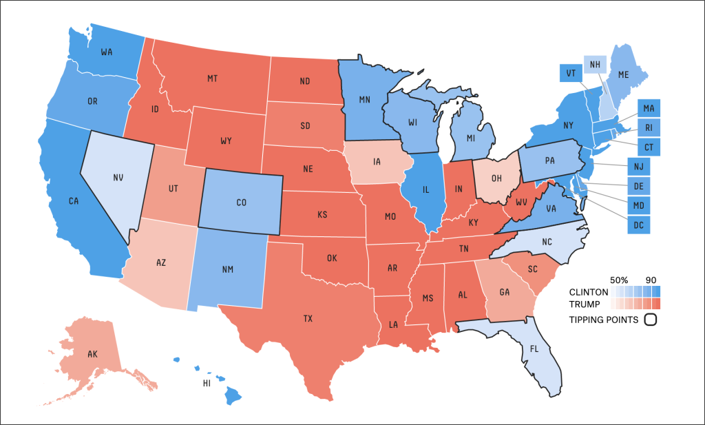
Anyone who follows election night coverage of the Electoral College is used to seeing the classic fifty states map—complete with floating Alaska and Hawaii—gradually shaded in red or blue as states are called for each candidate. But as Vox notes, the map isn’t just unhelpful, it’s misleading due to the prominence of vast states like Montana with small populations, which matter less to the Electoral College than small states with big populations.
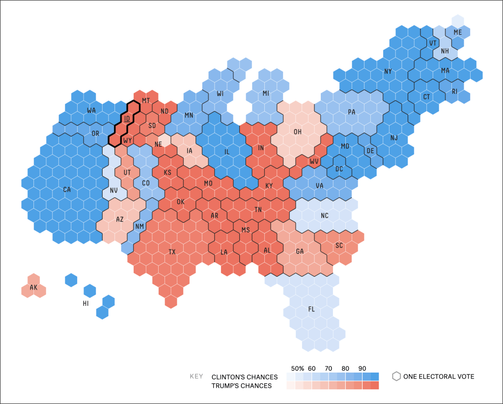
Contrast that with the map below, called a cartogram, which depicts each state’s size in proportion to its share of electoral votes. Students who learn to interpret, and eventually create, the latter will soon learn not to take every graphic at face value, and what to look for when parsing complex imagery.
Creation
Students are “often answering questions, telling stories, and sharing surprising information through activities such as book reviews or reports, research projects, and personal writing,” say the authors. That means they likely already have the skillset to begin processing and presenting that information in new formats.
Ask students what they hope to accomplish with their infographic, and how the elements they choose create that narrative. But avoid too much pre-planning, the authors suggest, because working with infographics should provide students with the freedom to either start with the graphics or text first, or create them in tandem.
Infographics naturally strengthen higher-order thinking skills, as students must apply what they’ve learned from exploring and deconstructing existing ones. To further model the assignment, teachers can create their own designs beforehand, or construct one as a class before setting students to work on them alone or in groups.
Classic software tools, including PowerPoint and Word (and their equivalents) can create simple graphics, but newer tools like Canva, Easel.ly, Piktochart, and Visme all feature dedicated infographic templates that can elevate visual designs and help add complexity.
Interrogation
While infographics often convey meaning all on their own, they’re also well suited as accompaniments to traditional assignments. The final phase of Smith and Robertson’s framework is to integrate them into a larger piece of writing or presentation.
In one example they cite, an infographic about what kinds of pets are kept by students in the class might be paired alongside a broader assignment about how classmates are similar and different to each other.
Separately, teacher Pearl Jonas has a Pinterest board collection of student-created infographics on 20th century American history topics, where students deftly layer maps, graphs, statistics, and text to create professional-looking infographics.
Thus, infographics can be used to illustrate relevant periods of time or to sequence historical events, such as exploration and global trade. A bisected graphic with images of two characters from a book could likewise compare and contrast their traits and motivations as part of a book report.
Such exercises will only improve students’ visual literacy in an increasingly multimodal world, write Smith and Robertson. It’s just another, important step toward helping them understand the whole picture.