What They See Is What We Get: A Primer on Light
Ten myths about lighting and color in schools.

Most architects and designers (though unfortunately not all) have long known that in schools, access to natural light improves learning and test scores, while poor electric lighting distracts students and can abet inattention and even lead to a kind of creeping depression.
Though many school buildings have naturally lit classrooms, their interior rooms and workspaces rarely see daylight. In this and so many other ways, school buildings organized around plans developed in the industrial era for efficient management of work today resemble prisons, where the central design mandate is to manage the largest number of inmates with the smallest number of guards. If we don't want our schools to function like prisons, we need to understand the difference between design that punishes and design that nurtures. Because it's rarely possible to redesign a school from the ground up, a good starting point is to debunk some of the persistent myths about lighting and color in schools.
Myth #1: A Room's Brightness Level Should Be Uniform
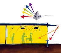
Many specifications and building codes for school buildings call for a uniform brightness of fifty-five foot-candles in academic spaces. In twenty years of educational architecture, however, I have never been criticized for varying the lighting levels. Uniform illumination makes sense for an assembly line, but for school it's a concept that is past its time. A better approach includes brighter illumination near the center of the room than in adjacent bays or niches.
Light fixtures suspended from the ceiling can direct some of the light upward and a portion downward. These high-performance fixtures, referred to as direct/indirect pendants, provide a balance of even light reflected off the ceiling and more focused downlight at work surfaces; with this more evenly distributed approach, thirty to forty foot-candles is usually adequate at the center of action, with twenty to thirty foot-candles in adjacent areas. Stronger, directed lighting on display or teaching walls provides a visually dynamic learning environment.
Myth #2: Windows with Outside Views Are Distracting
Many traditional educators believe that windows distract students from focusing on the teacher. They prefer high windows or skylights, drawn shades, or, as in the case of many schools designed in the 1960s and '70s, no windows at all. For many students, spaces without visual connections to the outside create a closed-in feeling and increase anxiety. Kids in such schools focus less on learning and more on escape.
Myth #3: Primary Colors Are Ideal in Environments for Young Children
Most people believe -- and too many architects seem to agree -- that brightly lit rooms painted with primary colors represent the best environments for young children to learn in. This belief is not borne out by any reputable research. What we do know is that children are wonderfully sensitive and responsive to nuances in both lighting and color. When given the choice between a box of six crayons and one containing one hundred, guess which one they choose? Children are particularly attuned to the colors of nature and human skin tones, and yet these hues are completely out of the primary range. Primary colors can be harsh, and are best used sparingly.
Myth #4: Red Incites Aggression and Green Is Calming
The research indicating that red incites aggression, green is calming, and yellow stimulates the intellect is simplistic and outdated. Hundreds, if not thousands, of schools, hospitals, and prisons were painted light green (thought to induce calm) in the middle of the twentieth century, with the result that this perfectly good color family was tainted as an institutional kiss of death by the 1980s and '90s. When the spectrum is used thoughtfully, all colors have a place for learners of all ages.
Myth #5: Neutral Colors Are Best
A common myth is that the best palette for learning environments consists of neutral colors, because it allows the students and the teacher, rather than the architecture, to become the focus. Architects may proclaim proudly that they have specified six shades of white in a school building, only to learn they are the only ones who notice any distinction. Research shows that learning benefits from a carefully applied stimulus-rich environment, not from a palette dominated by gray, beige, white, or off-white. There is rarely a good reason to take a completely neutral approach with educational architecture.
Myth #6: Full-Spectrum Lighting Is an Overhyped Fad
Lighting designers, thinking of the hyped commercial claims for full-spectrum lighting, often wrinkle their noses when someone mentions it. But no broad industry consensus exists regarding what constitutes a full-spectrum lamp, or what clinical benefits they offer. However, it doesn't take a major leap of faith to understand that a fuller spectrum of light, one closer to that produced by daylight, is desirable. It's clear from our experience that lamps with a higher color-rendition index (CRI) and a fuller spectrum result in happier, healthier learning environments.
The typical fluorescent lamp has a CRI of 72. (Daylight, the top of the scale, is the benchmark, at 100.) For a modest additional cost, a CRI of 84 is easily obtained. At the next step up, lamps with a CRI of 95 or 98 are available at commercial distributors, and the difference is dramatic.
Myth #7: It's Best to Use Only Light Colors Because They Make Rooms Feel Larger
It is a good idea to use a larger percentage of ceiling and wall surfaces with a higher light-reflectance value (LRV) in order to boost lighting efficiency. (Lighting designers can reduce the number of fixtures by as much as 25 percent by taking the LRV of adjacent surfaces into account.) And, yes, light colors can make a room feel larger. Achieving lighting efficiency and having spaces that feel big, however, aren't good enough reasons for exclusive use of light colors. Using darker accent colors in selected areas creates more varied, interesting spaces, and a brightly lit, richly colored wall at the far end of a room will draw students through the space, creating a sense of movement with light and color.
Myth #8: It's Best to Use Identical Lamps Throughout a School
Uniformity of this kind has nothing to do with how we learn; it has everything to do with what's easiest on the purchasing and maintenance departments. Businesses can't compete using this kind of approach. If they don't respond to what consumers want, competitors will beat them. Learning organizations are becoming more like businesses; the successful ones are focusing on the educational consumer, not on their own convenience. To prioritize the needs of the consumer/learner, it makes sense to stock a variety of lamp types and to use each where it functions best.
Myth #9: It's Best Not to Use Natural Light in Gymnasiums
It is often assumed that natural light is difficult to control. It's the single most important design element in a learning environment, including sports and physical education facilities, and eliminating natural light in gymnasiums because it isn't uniform is a lazy approach to design. Using north light, filtered light, and adjustable lighting-control devices are just a few ways to utilize natural light in a competitive athletic environment.
Myth #10: Performance Spaces Should Not Have any Windows
This myth is based on the assumption that every aspect of lighting must be fully controllable, and the only way to do that is to eliminate unpredictable daylight. After spending hundreds of hours with actors, dancers, and musicians, however, I believe performers prefer spaces that more closely resemble artists' lofts, with lots of light and views of the city, the landscape, or campuses. During the planning process for a new high school in Bridgehampton, New York, the school board -- including many professional theater people -- asked for a tabula rasa, a blank canvas for students to design, rather than a structure that itself would dictate the creative approach. The range of lighting choices included an option for natural light and transparent surfaces that allow for interconnectivity between performance spaces, social spaces, and learning areas.