Inventing Infographics: Visual Literacy Meets Written Content
I'll admit it. In my early years as a teacher, I thought that encouraging students to improve their writing invariably involved encouraging greater depth, adding more detail, crafting more complex sentences. In short, I implied to my students that the most valuable revisions involved adding to our work and that writing better equaled writing longer.
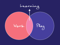
Enter the infographic, the twenty-first century text/structure/genre/design that blows my earlier beliefs about "better = longer" right out of the water.
As texts compete for attention with soundbites, scrolling headlines, tweets, and vines, writers and readers alike are seeing the value of text that uses visual design features to organize ideas, provide background, and emphasize key facts in ways that make it easier for readers to engage a topic thoughtfully. I have always encouraged my student writers to "swim deeply" when they read and write, moving beyond the basics, braving the imposing waters at the "deep end of the pool." Reading and writing infographics is like cannonballing into ten feet of water -- you splash in deeper and more quickly.
I knew that this year I wanted to have students experiment in creating their own infographics, so I made an early decision to build infographics into our Article of the Week routine (inspired by Kelly Gallagher). I occasionally substituted an infographic or two instead of the news articles or essays they were accustomed to reading. Of course, the reaction was positive. The first thing students noticed was the substantial time savings in reading an infographic or two versus a traditional article. It was like asking them to read Animal Farm after completing Great Expectations -- there was an immediate “can do” reaction.
Getting to Know Infographics
The key to creating infographics is understanding that the finished product looks deceptively simple. Every decision, including font, shapes, color scheme, and use of white space, will either contribute to or detract from the overall clarity of the message in the finished infographic. This makes them particularly good for helping students to swim deeply.
So after a few exposures to basic infographics, we studied three very different infographics side by side. Using the website Daily Infographic or just a Google Image search for the word "infographic" will help you find three that work for your class. This year, we combined these three in an Article of the Week reading assignment:
We discussed the following:
- Which of these was the best infographic and why?
- How does the writer try to engage an audience, even an audience who may not initially care about the topic?
- Is the text or the visual design most important in each of these? How does the use of color and white space affect your ability to focus on the main message of the infographic? How is font size used to emphasize certain facts?
- Does the infographic make a claim or develop an argument? If so, how can you tell?
The question of "best" was intriguing. Each infographic had supporters, and often the reasons had more to do with the design and how it delivered the message than with the student's intrinsic interest in the topic. This is important to note with students preparing to create their own infographics. Just like any other sort of writing, how you convey your message is just as important as why you are creating the message.
Experiments in a New Medium
Soon after reading and discussing published infographics, we created quick sketches in our Writer's Notebooks using infographic techniques. The challenge: show us something about one of the main characters in The Book Thief using a simple infographic instead of a paragraph. The results shown below demonstrate that through use of white space, size and proportion, simple language and limited text, students were able to meet the challenge.
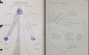
Of course, these initial efforts look more like traditional graphic organizers than the keen, svelte creations we find online or in Time. So our next step was to create something truer to the form. The Web is filled with tools to create infographics, but for my students' first exposure to creating their own, I employed a PowerPoint template that I found on Beth Kanter's blog.
For those teachers who would argue that PowerPoint is an overused tool and not particularly well-adapted to creating infographics, I would agree. However, considering that students had only a little exposure to the genre and that I had slim experience teaching it, using a comfortable tool and employing it for new purposes made sense. A selection of templates helped us to do that.
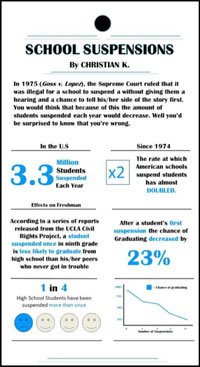
At the end of a research project about Supreme Court cases that have influenced the rights of teenagers, students prepared an infographic using multiple sources of information cited in a Works Cited Page and one template from the collection linked above. The example to the left shows current suspension statistics after Goss v. Lopez established a student's right to a hearing prior to a suspension.
Welcome to Philly!
While templates helped us dabble in infographic creation, it wasn't until we actually had to transform information from article form to infographic form that we faced the complexities of infographics from scratch.
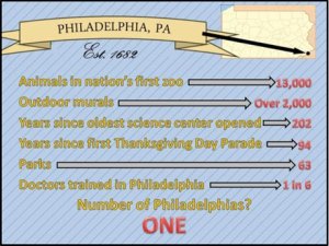
I live and teach in suburban Philadelphia, so my students have visited Philly many times for sports and cultural events, field trips, etc. After reading our Article of the Week entitled "50 Things You Probably Didn’t Know About Philadelphia," I challenged them to create an infographic from scratch that used text, color, and design to highlight several of the facts that would be most likely to attract tourists. Notice that while we were basically reshaping the information in the article, it was important to introduce a target audience and purpose at this point. After all, a key to good revision is knowing what to remove -- in this case, the facts that would be irrelevant to potential tourists. Here are examples of what my students created:
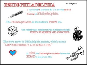
As a class, we critiqued the work onscreen. Was the infographic easy to understand on the first read? Did fonts and simple icons help to meet this objective? Was there a "flow" to information, or was it cluttered? Did the facts chosen work well given our purpose of attracting tourists to Philadelphia?
In the upcoming school year, I look forward to engaging with this type of text further and investigating the many online resources for creating infographics. I had one student use Piktochart to create the Philadelphia tourist assignment, and she found the website user-friendly. A colleague recommended easel.ly as a useful website that helps students create professional infographics when a class is ready to move beyond PowerPoint. And of course Prezi provides an easy means of creating interactive infographics with plentiful templates and a zooming canvas that never fails to impress.
Picture This
If you're considering diving into this 21st century text with students, the process is simple. Start by reading and discussing several. Don't just discuss content, but purpose, design, and organization. Sketch and experiment in a Writer's Notebook. Try starting with a template when students create their first infographic, then try another with an empty canvas to challenge them further. Don't forget to establish purpose and audience to help trim the content that will be included. And don't worry if you're not the greatest tech guru in the school -- the elements of strong infographics are as accessible as Power Point. Most importantly, you have the opportunity to explore a new type of reading and writing with your students, learning together, side by side.