Design 101 for Educators: Choose Your Fonts Carefully
Before we dig in, let's start with a quick multiple-choice quiz:
Font : Text ::
A. Hat : Head
B. Coffee : Tea
C. Voice : Speech
The answer is C. The font you choose to display text is every bit as important as the voice you use to speak if you want a reader to not only understand what they are reading, but also remember it as well. The primary purpose of type is not really to be readable, but to convey information that is to be remembered. Surprisingly, readability might not always lead to the best information retention.
Think about the last really great talk you listened to. Do you remember the content of that speech because it was compelling information or because the speaker spoke compellingly? It was probably a bit of both. However, no matter how vital the content of the speech, a speaker who drones on clearly but monotonously is far less likely to make a lasting impression than someone who speaks with animation and purpose.
Yet we spend very little time considering the font (or typeface) we use to communicate our messages. All too often we stick with the few fonts provided by our word processor, usually the default font, which is going to be the workhorse font Arial. However, imagine a world where everyone sounded exactly the same, where every voice had the same tones and inflections. It would be like a world of monotonous computerized voices. That's what text in Arial (or Helvetica on the Mac) is starting to feel like.
Clarity Does not Always Lead to Understanding
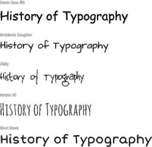
It is often assumed that good typography is about clarity, that the text should be as easy to read as possible. However, blogger Christian Jarret reports in Research Digest that studies by Connor Diemand-Yauman of the Princeton University Department of Psychology and his colleagues may call this assumption into question. Their research found a correlation between the effort it took to read text and the ability of subjects to remember that information for later testing. Yes, information presented in a "harder-to-read" font -- such as Comic Sans -- was better remembered than the same information in easier-to-read type.
One theory is that making the subjects work harder to read text forces them to focus on the text more acutely, engaging deeper parts of their brains than if they could simply breeze through it. Jarret observes from the report by Diemand-Yauman:
An alternative theory on this affect may be that most people pay attention to handwritten text as being more "authentic." Whatever the reason, this seems to be something that many designers inherently know, recognizing that making text more engaging is a better way to convey information that needs to be remembered. There's obviously a balance to be struck. If material becomes too difficult to read, students may simply give up or become more confused. But equally, if it's too easy, they may become bored and complacent.
In Praise of Comic Sans
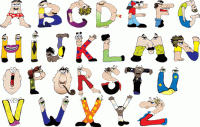
Comic Sans is often the butt of jokes -- "Comic Sans walks into a bar and the bartender says, 'We don't serve your type here.'" Given what Diemand-Yauman and his colleagues have discovered, that ridicule may be unfair. Comic Sans has a very specific voice, one that -- to a less jaded audience like elementary school students -- feels friendly and familiar, and is very similar to the way in which these students are being taught to write. In fact, one teacher at my son's school explained to my wife that she prefers Comic Sans specifically because it is the only commonly available typeface that shows the form of the letter "a" that she is teaching her children how to write.
However, Comic Sans is not the only handwritten font on the block, nor should we assume that the effect noted by Diemand-Yauman and his colleagues is isolated only to handwritten fonts. There are many alternatives that you can choose from.
Choosing Your Font "Voice"
What designers rely on with typography is finding fonts that help reinforce the message of the text being presented. This may simply be a matter of finding a single typeface or two that will become your unique typographic "voice" -- or it may be that you begin to choose different fonts for the project, picking ones that reflect the tone of the text you are providing your students.
When choosing a font for presenting your own materials, you want to consider two types of content:
- Titles and Headers: Headers are meant to call attention to themselves and set the mood for the text underneath.
- Body text: This should generally be a little calmer and clearer to read, but still provide some visual interest to your students in order to keep them engaged. When choosing a typeface for body text, though, make sure the one you choose has a regular, bold and italic style.
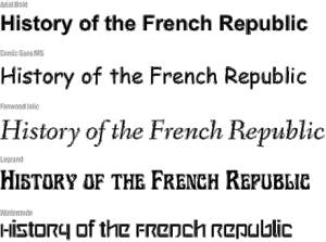
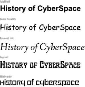
You may choose the same font for both cases, but if you do choose different fonts, make sure they are very different. Pairing fonts that are similar but not the same is like wearing two similar but different cloth patterns: they invariably clash.
Finding Fonts
What a lot of people don't realize is that not all fonts are free. In fact, many cost tens or even hundreds of dollars apiece. Even the "free" fonts that come on your computer were actually licensed by the computer manufacturer. You are paying for them in the cost of your computer.
The good news, though, is that there are thousands of free fonts on the Web. One of my favorite repositories for free fonts is FontSquirrel.com. This site has over a thousand fonts to choose from, including over 50 handwritten fonts, and hundreds of clean sans-serif and serif fonts that will work well for body text. My other favorite source for free fonts is Fonts.com, which is home to some of the highest quality typefaces around, including Comic Sans and the new Comic Sans Pro.
Another great alternative to downloading fonts is to make a custom handwritten font with a program like iFontMaker, which allows even a novice to create his or her own custom handwritten font on an iPad ($6.99) or Windows Tablet ($4.99).
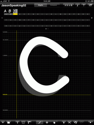
I used it to create my own handwritten font called JasonSpeaking01. It took me a couple of hours, but the font really has a lot of my own voice in it. If you like this font, you can download it for free.

Whatever font or fonts you choose to get your message out, make sure you choose one that balances readability with personality, and you will find your students becoming increasingly engaged with whatever text they are reading.
Online Resources
- Free Fonts: FontSquirrel.com
- More Free Fonts: Fonts.com
- Another Free Font: JasonSpeaking01
- Font Tool: iFontMaker
- Windows Help: Installing Fonts in Windows
- Mac Help: Installing Fonts in Mac OS X