Design 101 for Educators: 5 Simple Typography Tips
Once upon a time, typography was the domain of a few arcane professionals with ink-stained fingers who labored away at huge machines, setting letters one at a time. These days, everybody is a typographer. Anyone using a word processor, writing a blog, or just sending emails is setting text to communicate ideas.
Typography is to text what voice is to speech, yet too often we sound like we're talking baby talk, yelling, mumbling or -- worst of all -- we just sound monotonous. The way in which you present your text is at least as important as what you have to say when it comes to effectively communicating ideas, whether it is a doctoral thesis, syllabus or mid-term exam.
1. Know Your Voice
With the explosion of high-quality free and inexpensive fonts available on the Web, there's really no excuse anymore to "sound" like everybody else. Every typeface has its own unique voice, and you can use that to help get your message across.
You need to find fonts that will help express your own voice or illustrate the subject you're talking about. This may be a particular font that your students begin to associate with your handouts or other work, or you may want to spend time picking fonts that really reinforce your subject.
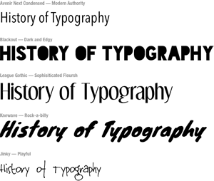
Remember: Every font has its own voice that you can use to express your ideas.
2. Keep it Simple
While you need to try different typefaces to establish a distinctive voice, combining too many font "voices" can lead to noisy-looking pages. Type is like a choir -- it's not that you can't have a number of distinct voices singing in unison, but the more voices you add, the more practice it takes for them to work in harmony.
Beginners should use a single typeface with a range of styles -- bold, italic and bold italic are a good start. You can then use these to add typographic contrast without having to bring in additional fonts.
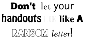
Remember: Choose one typeface to start with, and build your repertoire from there.
3. Use Type Contrast to Emphasize What's Important
I often see handouts and tests where everything on the entire page is in bold to let you know just how important everything on the page is. The problem with making everything bold, though, is that if everything is important, then nothing is important.
Bold (also called "weight") or italicized text should be used when you want to draw attention to a particular piece of text by contrasting its style with the surrounding text. To be effective, keep your use of contrast as short and targeted as you can.
Contrast can also mean using different text sizes and even contrasting colors (use shades of gray to begin with). The point is drawing attention to the areas where you want your students to pay special attention, and encouraging them to scan back over the important parts at a glance.
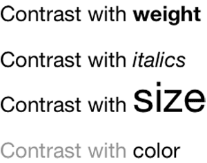
Remember: Keep it simple, keep it consistent -- and don't OVEREMPHASIZE!!!!!
4. Don't Be Too Narrow or Too Wide
One the simplest problems to fix with most typography is making sure that your columns don't get too wide or too narrow. Long rows of text disrupt the reading rhythm by making it hard for the reader to find the next line, while short lines feel staccato when reading for lengthy periods.
Figure 4. Go for the Goldilocks width (Click to enlarge.)
Credit: Jason Cranford Teague
In general, paragraphs should range between 52 and 78 characters wide, with an average of 68 being the sweet spot. The exact length your column needs to be in inches or pixels will depend on the size of the text you're using, but most word processors will allow you to select a line of text and tell you how many characters and words are in the selected text. Sample a few to make sure that you're within the right range.
Remember: The Goldilocks width for columns of text is around 68 characters.
5. Allow Room to Breathe
Filling the entire page with text is a sure way to guarantee that no one reads what you have to say. If you really want to vastly improve your typography, catch your students' attention, and make sure they read what you give them, then leave a lot of space.
Figure 5. Which would you rather read? (Click to enlarge.)
Credit: Jason Cranford Teague
Sometimes, this may mean taking a sharp razor to what you've written and paring it down to the essentials, but I cannot overemphasize that when it comes to typography and readability, less is more. If your goal is to communicate and be clear, then you may need to spend less time writing and more time editing. This doesn't mean dumbing anything down, but information is useless if nobody reads it, and maximum verbosity is a good way to turn readers off.
Remember: Leave plenty of space between columns, headers, lists and other elements and use a line height (also called leading) of at least 1.5 points.